⭐️ Sizsights Project - Web Application
- Howard Chen

- Oct 4, 2020
- 6 min read
Updated: Oct 10, 2020
Sizsights is the latest and biggest project that I have ever done. It is a web application that gather data from various different platform and sources such as Australian Bureau of Statistics, Tourism Research Australia, AirBnb and etc so as to display them on the map to provide visions for investors to choose and decide where to invest can output the best possible revenue.
My responsibility of this project were as follows:
Concept Design
UI Design (Wireframe, Interactive Prototype, Iterations)
UX Analysis (conversations with users and stakeholders)
Front-end Development (Angular framework)
minor API writing and unit testing in C#

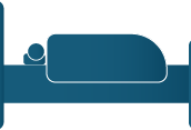
Above is a screenshot of current product after a year of production. Coming up, I will walk you through how this application came about from the very beginning.
This blog post consists of 5 sections:
Concept Design;
Wireframe;
Interactive Prototype;
User Experience Testing & Analysis;
Graphic Design on Sizsights.
Concept Design
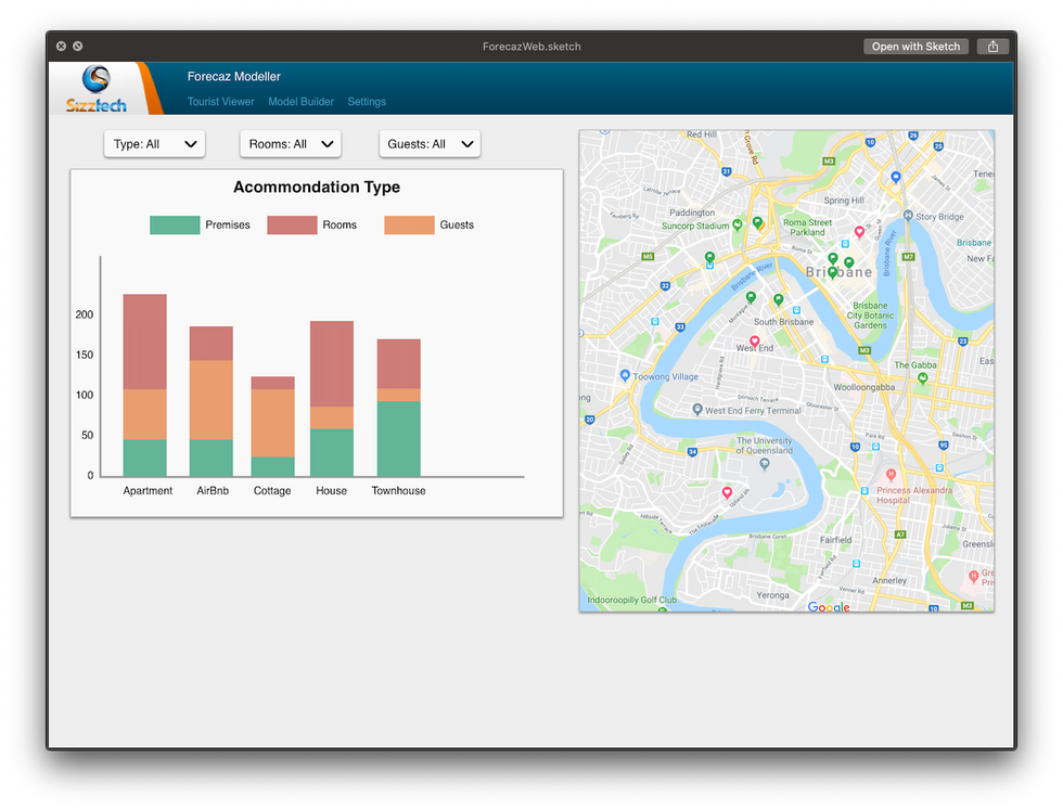
Concept of the sizsights project started with the help of current product of Sizztech called Forecaz Modeller. Forecaz Modeller is an urban planning web application that predicts urban growth and provide projection data based on regions.
The new project Sizsights, however, is also a data display web application based on geographic location. Thus, early digital prototype is made of a combination of UI components of Forecaz Modeller and new ideas.
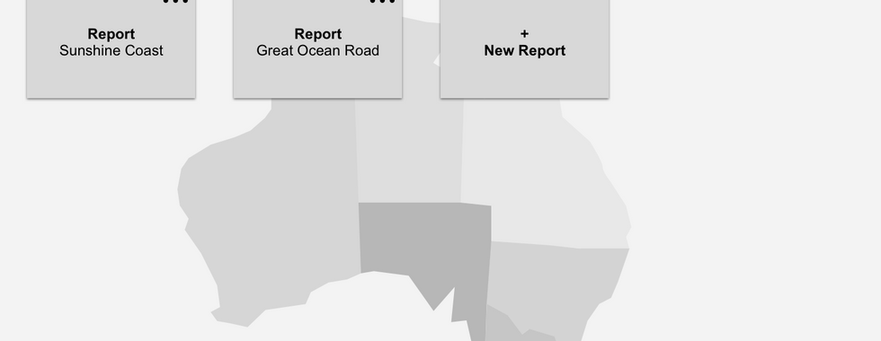
Some of the early concept designs are as follows:


Wireframe
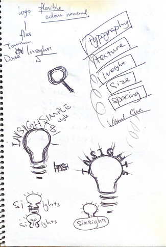
The sizsights project started with pen and paper. All the idea of the application and visions are drawn on paper and iterated over and over before digital design started.
This includes the structure of the application, potential functionalities to be integrated into the structure, potential charting dashboard & categories, user workflow design etc.
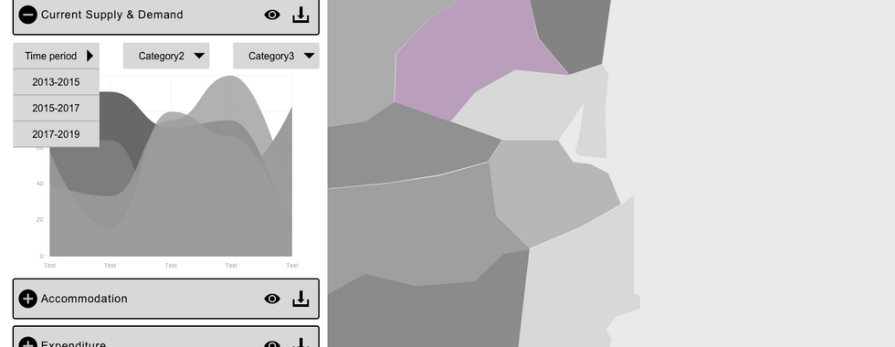
Here are some of the sketches I drew for Sizsights at the very early stage:


After discussion and iterations were made on the paper sketch, these ideas were then quickly turned into digital design for user testing. Normally we would use paper prototype to conduct user testing on wireframe but because this was during lockdown from COVID-19, we had to convert them into digital and conduct online testing.
There have been 5 iterations altogether for this wireframe and each of the wireframes are saved as a different digital file (Sketch file). The followings are the first draft and the final draft of wireframe presented as slide show to demonstrate the progress.
First Draft


Final Draft


Throughout the iterations of the wireframe, we get to see more clearly what our stakeholder really wants and what goals that they are set on and what are not clear. We refined the goal and basically set out a vision for what the application could look like.
This is quickly turned into digital prototype and tested between target user groups.
Wireframe Testing
Wireframe testing was set up in a way that there is an introduction, a pre-test interview, a task-based usability testing and a post-test survey.
Due to legal reasons, all of the company branding and links have been made unavailable to people. But the entire testing scheme is as in the file below. Feel free to read through the process.
The feedback received were very helpful and defined where the application is heading in terms of target users and functionalities. All of the feedbacks were used for the design and iterations of coloured design.
First Coloured Design
During wireframe user testing, I also started with the design of the colour scheme of the application. This includes design stylesheet making, colour collections, logo design and icon design.

This very first draft of coloured application is the foundation of the UI Design of Sizsights. Even after months of development, the application basically based its foundation UI design and colour on this!
Interactive Prototype
Interactive prototype is based on the coloured design and feedback from wireframe user testing. Throughout the iterations of the design, there have been four major design changes but all of them are within the foundation UI structure. Each of the prototypes are used for UX Testing and Analysis which will be discussed in the next section.
I have been working in between Front-end Development and constructing the new designs. Below are the first and final interactive prototype in slideshow respectively.
First interactive prototype
What I really tried to emphasis in this prototype is the clean and straightforward design. It is clean, easy to see the structure of the application, navigates smoothly.


Over the course of user testing, more and more widgets are added and the application starts to provide more functionality with some extra UI components added
Final interactive prototype
The last interactive prototype symbolise the end of this stage of development of the application. Compared to the first design, there are a lot more detail components on UI that greatly enhanced the user experience of the application.
The prototype is more accurate and resembles product under development better
Region selector structural changes and auto collapse
Region boundary display design
Points of interest panel design
Information guide modal for each section
Floating button control panel when scrolling through the charts
The list can go on but in short, this is the prototype that reflects the current development of the project with design insights into future features.


User Experience Testing & Analysis
Functional UI Testing
Functional Testing were conducted to test the UI components and features at the end of each milestone to ensure the delivery of the project. Basically the application is divided into sections depending on functionalities. This is where we make sure the connection between design and development is successful.
Below is a demo test script for Functional Testing. (Note that all company branding are erased for legal reasons).
User Experience Testing
UX Testing here is very similar to the one we had in wireframe testing. Basically the application is set up in a way that users can carry out basic functionality as in the development environment. The difference here in the design prototype than in the wireframe is that this prototype is coloured and one of the most important user testing is for the colour to come into play and alter designs if users have very different opinions on colour design.
That been said, user interface elements are still the most important area for testing. Below is a demo document for User Experience Testing. (Note that all company branding are erased for legal reasons).
User Accessibility Testing
User Accessibility testing were done as part of the later half of the development and we get to see some accessibility of the website. There was a delay in completion of the accessibility testing due to project planning, we still get to analyse the issue and fixed most of them.
All of these testing are based on WACG 2.0 AA criteria.
User Experience Analysis
After the testing of each milestone, there will be a period of time where I gather all information I have collected from conducting user testing and generate a document with all suggested improvements for the current project (based on user feedback).
This can range from a simple name change of a button to a complete section UI change. They are marked in different colour to indicate whether it's a bug, something that we should fix immediately or an issue that can be resolved later.
Here is an example of a user testing feedback file:
Graphic Design on Sizsights
Logo Design
Sizsights is a new project under the company Sizztech, not surprisingly, I was asked to do a logo design for this project.
Without a doubt, I instantly started thinking of how to integrate the old Sizztech company logo into the new Sizsights logo just so people can see the connection in company and product.
Below is the current Sizztech company logo, a lot of my inspiration is derived from this specific logo design but with new insights into the name.

So off I went on about sketching the ideas


After some discussion with colleagues and iterations, I came up with this logo design. It is presented in two different form - horizontal or vertical.


Icon Design
Throughout the project, many of our icons are custom made just so it fits in the purpose of our application and not needing to worry about copyright issue of using third party icons. Most of these icons are made in the theme colour of Sizsights (purple), with a few exception of grey scaled icons.


Microsoft Custom Login
For user authentication in Sizsights, we chose to go with Microsoft login. However, a design is required to decorate the standard MS login page into a more Sizsights friendly style. This is what I have come up with and our client really enjoyed it.
The background spoke very loudly and clearly that it is an application based in Australia and that it will have something to do with tourism industry, which is exactly what Sizsights all about. Also, the tone of the background image emphasis the colour purple which is later used as the theme colour of Sizsights.
This login page, though not the most notable part of the project, delivered insights into the project from details like background image.

Comments