Reivernet Project - Tablet Application
- Howard Chen

- Oct 4, 2020
- 5 min read
Updated: Oct 10, 2020
Reivernet is a project that I have been on for a 5-week contract to improve the UI design and User Experience of the application.

Reivernet is a windows application that is designed to be used on Surface or similar tablet. It targets surveyors and help them with inspection of buildings. The application is here to provide a way to digitalise a building structure for surveyor to replace their usual way of using pen and paper.
My responsibility during my contract on this project are as follows:
Analyse UI Design of the application
Creation of a stylesheet for developers to follow for future development
New feature UI components design
Colour theme design for existing UI
User Experience Design & Analysis
Stylesheet
After conducting my first User Interface Analysis on this specific project, I found out that there are many inconsistency throughout the application. For example, the button style on one section is drastically different from the section just right above it, etc.

Thus, a stylesheet was made to ensure the consistency of UI elements in the application.
The stylesheet is divided into several parts: Layout; Colour Scheme; Colour Palette; Iconography; Button styles; Application Structure; Typography and User Interactions.
Layout specifies the basic UI element structure such as how a header structure is or the style of tab structure is to be used in this context.


Colour Scheme is a combination of all of the colours used in the application with hex code given for each of the colour. This is referenced every time a colour need to be chosen.

Colour Palette gives the variety of colour used in the application. This is particularly useful when a new colour need to be chosen for the application. It need to be checked with the compatibility of current colour palette before making the decision.

Iconography provides the collection of all icons used in the application. This is for scenarios when an icon is to be used but there is no set icon to choose. This is where the decision making would happen. If new icons are to be added into the project, they will need to be added in the collection in the stylesheet too.

Buttons section defines the different type of button deployed in the application, making sure they are consistent and used for a refined purpose. For example, all buttons in controller bar is icon text button but those in confirmation box will always be text buttons.

Application Structure provides a breakdown of the entire application functionality structure. This is very important and handy when it comes to functional testing or when a new feature/functionality is to be added into the project.

Typography defines the text size and font for each specific UI elements. In the case of this application, font does not apply because of the environment default font settings. It will be very important for improving the readability of text within the application.

Interactions - a section that helps with UX analysis. This is the section where how users interact with the application is analysed and presented so that future features are all tested and evaluated based on the effectiveness of the interaction to be provided to users.

UI Design
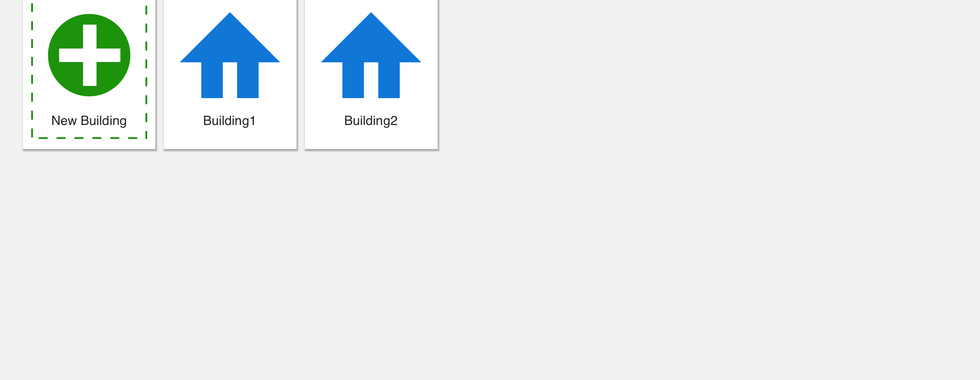
New user interface elements designed
- Room detailed page redesign
Original design: an inquiry was raised by our client to reduce the screen estate attachment section is occupying as attachment section is not used as much as the other sections.

Design solution 1: reduce the attachment entirely to as part of the tab system.
Our client came back with the fact that they still with to have a sneak peek of the attachment section on screen and not as part of the tabs. They also wish to have a more efficient way to see all of the information for a specific room.


Design solution 2: Tab system were changed into separate sections as waste screen estate were found in the tab list structures. All sections have reduced screen area but provide the more data to users at once.

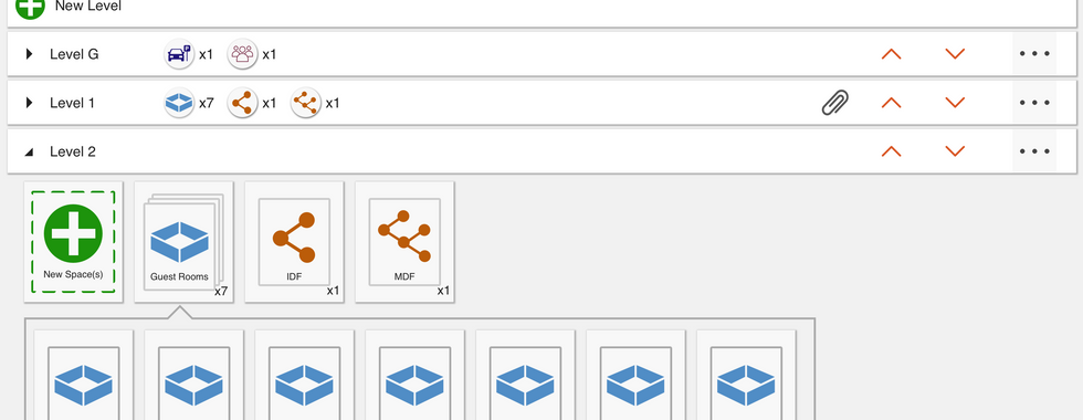
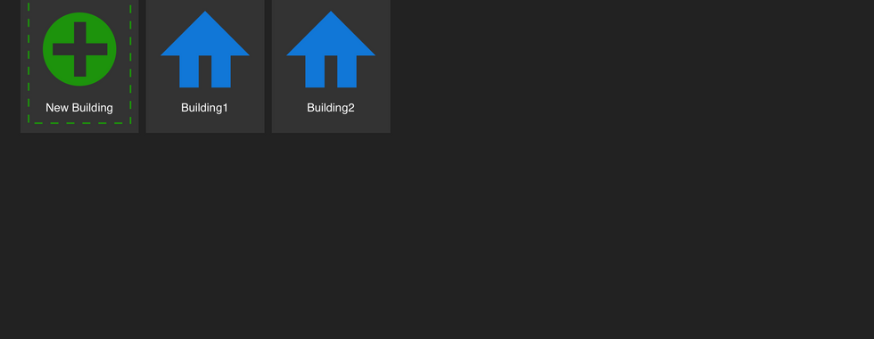
- Level room style redesign
For each room on a level, we need to show more information as to what is in the room so that a surveyor won't need to open every single one of them and find out about the basic information.
Thus, a system to integrate information outside of a room (within the room icon) is designed.
The original state:
Designs
First of all, a design that enables a level's room information to be previewed before expanding a level is designed as below. It tells how many of what type of room there are on each level so that it is easy and clear to see.
Second, the design to show data inside the room without the need to click into it is as follows. Firstly, there is the linkage and digit on top left corner showing how many linkage is to each room; secondly, attachment icon on top right corner indicating whether there is attachment(s) in each room or not; thirdly, the colour dotted/dashed/blocks of colour on the bottom of each icon is for other specific information about each room.
Below are the designs that I came up with the same solution. They provided great insights for our client to make a decision on which way to go.


Colour Scheme Design
A conversation was held when we realise that the application was default in dark mode or the theme colour of the interface is dark and there is no bright mode provided.
After study and research on this topic, I found out that all application actually starts with bright mode and then develops dark mode afterwards. This specific project has actually gone the other way around (since they did not have a designer on board).
Thus, I created the bright mode for the current application and also adjusted the current design just so that it fits into dark mode better.
This is the bright mode as of my design


This is the improved version of current application colour


UX Design & Analysis
Touch-Friendly Design Suggestions
Because this application is a Windows application that is designed to run on a Surface Pro, the user experience of this application need to be optimised for both mouse clicking as well as finger pointing, dragging and such.
Thus, I conducted a research on Surface Pro to analyse how people interacts/use Surface Pro and what should I pay most attention to when it comes to prioritise interaction response.

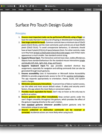


Then, I made the following suggestions based on the research and analysis.


All of these suggestions have been really helpful for our client to realise the importance of improving the user experience of the application and we were granted longer period time (more sprints) to the improvements of the user experience.
Colour Design Justifications
For all of the colour theme design, there is a justification for the design and they are all documented in detail in the following document.
UI Features
For each of the UI feature designs, there is justifications too and they are all documented in detail.
Comments